Artwork for Custom Cocktail Napkins: Logo Files, Colors and Proofs
The best artwork for custom cocktail napkins is a vector logo (AI, EPS, SVG or a vector PDF), simplified for a small, soft printing surface, with ink colors named and a proof checked line by line before approval. Customized Cocktail Napkins redraws rough files when needed and sends a free mockup within 24 hours, so you approve exactly what gets printed.
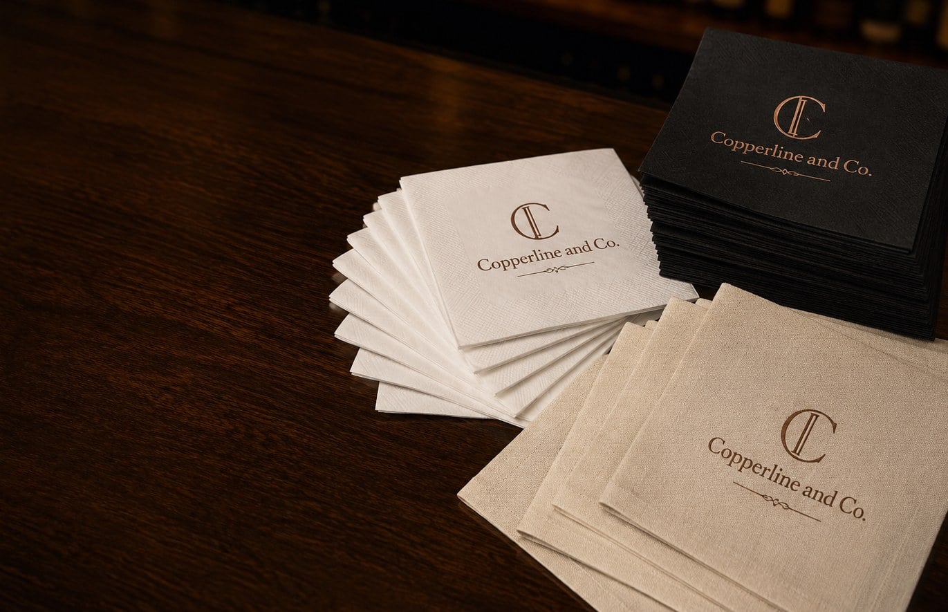
- Vector files (AI, EPS, SVG, vector PDF) print sharpest on napkin tissue
- Fine lines and tiny type blur on soft napkin stock, so simplify the logo
- Free mockup within 24 hours, unlimited free revisions
- Pay nothing until you approve the design
- Minimum order 12, standard turnaround about 2 weeks
What file format should I send for custom cocktail napkins?
Send a vector file for custom cocktail napkins whenever you have one: an AI, EPS, SVG or a PDF exported from a design program with the shapes kept as vectors. Vector artwork scales cleanly to any print size and lets the press separate each ink color precisely, which matters on a napkin because the printing surface is soft and slightly textured.
A high-resolution PNG or JPG can still work, especially for full-color digital printing, but low-resolution images pulled from a website or a social profile usually look soft or jagged once enlarged to the napkin corner or center. If a vector file is not available, send the best image you have. Customized Cocktail Napkins can redraw a simple logo or monogram as part of the mockup process, and you see the result before anything is printed.
- Best: AI, EPS, SVG or vector PDF with fonts converted to outlines
- Workable: large, sharp PNG with a transparent background
- Avoid: screenshots, photos of a printed sign, or tiny web logos
Also include any brand color references you use, such as a Pantone name from your style guide, so the ink match starts from your real colors rather than a guess from a screen.
How detailed can a logo be on a cocktail napkin?
Logos on cocktail napkins should be bolder and simpler than the version on your letterhead. Napkin tissue and airlaid stock are soft and absorbent, so ink spreads very slightly as it lands. Hairline strokes, thin script, tiny taglines and small reversed-out text are the details most likely to fill in or break up.
A good rule of thumb is to design for a quick glance across a bar: guests see the napkin for a second while setting down a glass. A crisp mark, a short name or a monogram reads instantly. A full address, a long hashtag and a paragraph of small print rarely survive the trip from file to tissue, and they crowd the design.
- Thicken thin lines and open up tight letter spacing
- Drop secondary text such as phone numbers or web addresses unless they matter at the event
- Use the stacked or icon-only version of the logo if your brand has one
- Keep reversed (knockout) text large and bold, especially on black and colored cocktail napkins
If your logo has gradients or photographic elements, full-color cocktail napkins printed digitally will hold them far better than a spot-color press.
How should I choose ink colors for custom cocktail napkins?
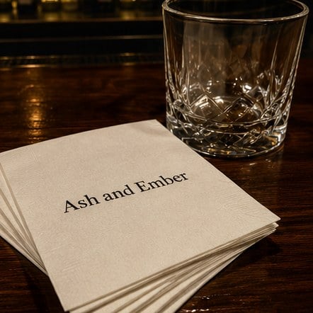
Choose ink colors for custom cocktail napkins by starting with the napkin color, not the logo. The same ink looks different on white tissue, ivory linen-feel stock and a black napkin, because the napkin itself shows through. Dark inks pop on light napkins; on dark napkins, light colors and metallic foil carry the design.
Spot-color printing uses one solid ink per color in the design, which keeps a two-color logo clean and consistent across a whole run. Full-color digital printing reproduces gradients, photos and many colors at once, which suits detailed artwork and illustrated wedding crests. Foil stamping lays a metallic layer, such as gold, silver or rose gold, and works best on simple, bold shapes.
| Napkin color | Inks that read well | What to watch |
|---|---|---|
| White or ivory | Navy, black, deep green, burgundy, most spot colors | Pale pastels can wash out |
| Black or dark colors | White, light metallics, foil | Thin reversed lines can fill in |
| Bright colors | White, black, foil | Ink and napkin colors can clash |
Colors on a phone or laptop screen are only an approximation. If an exact brand match matters, name the Pantone reference in your request and the mockup notes will confirm it.
Where does the design go on a cocktail napkin?
Most custom cocktail napkins print the design in one of two positions: centered on the folded face, or tucked into a corner. Both describe where the artwork lands once the napkin is folded and stacked on the bar, which is how guests actually see it.
A centered imprint gives the design the whole face of the folded napkin and suits monograms, wedding names with a date, and bold brand marks. A corner imprint feels more understated and classic, and pairs well with a short name or small icon, especially on linen-feel cocktail napkins for upscale dinners. Leave a margin around the artwork; a design that runs right to the fold or the edge can look cramped or be trimmed unevenly.
When you request a quote, say which position you prefer, or ask for both. Customized Cocktail Napkins can show the two placements side by side in the mockup so you can compare them before deciding.
Can I put names, dates or a monogram on custom cocktail napkins?
Yes. Names, dates and monograms are the most common text on custom cocktail napkins, especially for weddings, anniversaries and milestone birthdays. The key is spelling and format: send the text exactly as it should appear, including capitalization, ampersands and the date style you want, such as a full written date or a numeric one.
Script fonts look elegant but can lose detail on tissue, so choose a script with medium-weight strokes and keep the size generous. Pairing a script name with a simple serif or sans-serif date is a reliable combination. For monograms, decide the letter order in advance; traditional and modern couple monograms arrange initials differently, and the proof is the place to catch it.
Fun phrases, cocktail names and short quotes work well too. Keep them to a few words so the type can stay large. The wedding cocktail napkins page shows common styles if you want a starting point.
What should I check on the proof before approving my cocktail napkins?
Check every word, every color and the placement on the cocktail napkin proof before approving, because the approved proof is the instruction the printer follows. Customized Cocktail Napkins sends a free mockup within 24 hours, offers unlimited free revisions, and you pay nothing until you approve the design, so there is no reason to rush this step.
- Spelling: read names, dates and slogans aloud, letter by letter. Have a second person read them too.
- Napkin color and style: confirm the proof shows the stock you want, such as white, black, a color, or linen-feel.
- Ink or foil color: confirm the named ink or foil matches your brief.
- Position: centered or corner, and the orientation of the text when the napkin is folded.
- Size: make sure small text is still large enough to read on a napkin.
- Quantity and date: confirm the order quantity and the event date in the order notes.
If anything looks off, ask for a revision. Changes are free, and a small adjustment at the proof stage costs nothing compared with a reprint after the event.
Which artwork mistakes cause the most problems?
The artwork mistakes that cause the most problems on custom cocktail napkins are low-resolution images, text that is too small, typos in names or dates, and ink colors that disappear against the napkin color. Nearly all of them are visible on the proof if you look for them.
- Low-resolution logos: pulled from an email signature or website and enlarged until they blur.
- Too much copy: a full address and website squeezed into a small imprint.
- Low contrast: gold ink on a yellow napkin, or navy ink on black.
- Fonts not outlined: a vector file that substitutes a default font because the original was not included.
- Last-minute name changes: approving before the couple, host or client has signed off on the wording.
Sending a clean file, keeping the text short and checking the proof against your event details avoids almost every reprint.
How long does artwork add to a cocktail napkin order?
Artwork adds very little time to a custom cocktail napkin order when the file is ready and the approval is quick. The mockup arrives within 24 hours, and standard production of about 2 weeks starts once you approve the design, with faster turnaround available through express shipping.
The real delay is usually waiting on decisions: the final logo, the exact wording, or sign-off from a client or family member. Gather those before you request the quote, and you can approve on the first round. The minimum order is 12, so even a small test run for a tasting or a rehearsal dinner follows the same artwork steps. The how it works page walks through the full order process, and the custom quote form lets you attach your file today.
Frequently asked questions
Can I send a logo for cocktail napkins as a JPG?
Custom cocktail napkins can be printed from a JPG when the image is large and sharp, especially for full-color digital printing. Small JPGs taken from a website or email signature tend to blur when enlarged. Customized Cocktail Napkins reviews every file sent with a quote request and will redraw a simple logo or monogram when needed, showing the result in the free mockup before anything goes to print.
Why should fonts be converted to outlines in cocktail napkin artwork?
Cocktail napkin artwork with fonts converted to outlines keeps your exact lettering, even if the printer does not have the same font installed. Live text can silently switch to a default typeface when the file is opened elsewhere, changing the look of a name or slogan. Outlining the fonts in your design program before exporting the file prevents that substitution and keeps the proof accurate.
Will a script font print clearly on cocktail napkins?
Script fonts print clearly on cocktail napkins when the strokes are medium weight and the text is kept reasonably large. Very thin, delicate scripts can break up or fill in on soft napkin tissue. Pairing a script name with a simple serif or sans-serif line for the date keeps the design readable, and the mockup lets you judge the result before you approve it.
Can I match my exact brand color on cocktail napkins?
Brand colors on cocktail napkins are matched most reliably when you supply a Pantone reference from your style guide rather than a screen color. Napkin color and stock also affect how ink appears, so the same color looks slightly different on white, ivory or colored napkins. Customized Cocktail Napkins notes the ink match on the mockup so you can confirm it before approving.
Can a photo be printed on cocktail napkins?
Photos can be printed on cocktail napkins using full-color digital printing, which reproduces gradients and fine tonal detail that spot-color presses cannot. A sharp, well-lit, high-resolution image gives the best result, and simple compositions read better on a small napkin than busy group shots. The full-color cocktail napkins page at Customized Cocktail Napkins explains when digital printing is the right choice.
Is a centered or corner imprint better for cocktail napkins?
Centered imprints on cocktail napkins suit monograms, couple names and bold brand marks because the design fills the folded face. Corner imprints feel more understated and classic, pairing well with a short name or small icon. Neither is better in every case; the choice depends on the artwork and the event style, and the mockup can show both placements side by side.
What text works best on wedding cocktail napkins?
Wedding cocktail napkins work best with short text: the couple's names or initials, the date, and perhaps a brief phrase or signature drink name. Fewer words allow larger type, which stays crisp on napkin tissue. Send the wording exactly as it should appear, including ampersands and the date style, and have both partners check spelling on the proof before approval.
Can I print white ink on black cocktail napkins?
White ink on black cocktail napkins is a popular, high-contrast choice for bars, lounges and evening events. Bold shapes and larger text work best, because thin white lines on a dark napkin can fill in slightly. Metallic foil is another strong option on dark stock. Customized Cocktail Napkins shows the exact ink and napkin pairing in the free mockup so you can judge the contrast first.
Can I request changes to my cocktail napkin mockup?
Changes to a cocktail napkin mockup are free and unlimited at Customized Cocktail Napkins. You can adjust wording, swap ink colors, move the design from center to corner or resize the logo as many times as needed. Nothing is printed and nothing is charged until you approve the final design, so take the time to get every detail right.
Who is responsible for spelling errors on printed cocktail napkins?
Spelling on printed cocktail napkins follows the approved proof, so the buyer confirms names, dates and wording before production starts. Read the proof aloud letter by letter and ask a second person to check it, especially for names with unusual spellings. Catching a typo at the mockup stage is free, while a mistake found after printing usually means reordering.
Can different cocktail napkin designs be ordered at the same time?
Different cocktail napkin designs can be ordered together, such as one design for a rehearsal dinner and another for the reception, or separate logos for two venues. Each design gets its own mockup and approval. Mention every version in your quote request so Customized Cocktail Napkins can plan the artwork and production together and keep the delivery timing aligned.
Get a free mockup for your cocktail napkins
Send your logo or idea and the quantity you have in mind. Customized Cocktail Napkins returns a free mockup within 24 hours, you approve the design before anything is produced, and standard turnaround is about two weeks with faster options available. Get a custom quote.